
CHS
My Profile Redesign

Overview
As the first and only UX designer embedded on the security team, this project involved leading the end-to-end redesign of the My Profile experience, establishing a foundation for user-centered design within the group. With limited access to users early in the process, the design approach was guided by heuristic evaluation, competitive analysis, and UX best practices. The work set new standards for cross-functional collaboration and laid the groundwork for more consistent, scalable UX across future initiatives.
Problem
The original Edit Registration experience was difficult for users to navigate and lacked clarity, leading to incomplete tasks and increased reliance on support. In addition, inconsistent UX/UI patterns and misaligned CHS branding contributed to user confusion and a lack of trust in the interface.
Value Statement
The redesigned My Profile experience provides users with a clearer, more intuitive way to manage their account information, reducing confusion and support needs. By aligning with CHS branding and design standards, it builds trust, improves usability, and lays the foundation for scalable, self-service features.
Impact
The updated My Profile design resulted in a 67% increase in customer satisfaction, highlighting major improvements in usability, clarity, and overall user experience. The redesign also revealed opportunities for future enhancements and additional feature development.

-
Roles
User Research
Prototyping
UX Review
User Testing
-
Team Members
Product Owner: Carly Graves
Technical Lead: Nu Maniphanh
Engineer Lead: Anthony Larson
Developers: Xavier Thurman & John Bielejeski
Business Analysts: Amy Belisle & Kari Ripperger
Quality Analyst: Kranti Vennu
-
Tools Used
Figma
Miro
Azure DevOps
Microsoft Teams
01 Discovery
User testing was not performed, as formal research practices had not yet been established within the CIAS team.
Approach
In the absence of direct user input, the team relied on:
Heuristic evaluation to identify usability issues.
Competitive analysis to understand common patterns.
UX best practices to guide design decisions and reduce risk.
Heuristic Analysis
Uncovered pain points such as:
Unclear navigation
Inconsistent labeling
Misaligned CHS branding and UI elements
Missing feedback during key user actions
Competitive Analysis
Focus Areas:
Profile layout and organization
Labeling and terminology
Editability and user control
Visual hierarchy and accessibility


02 Ideation
Sketching
Design phase focused on quickly exploring multiple solutions through sketching. This helped save time by working through ideas before moving into wireframing and prototyping in Figma.
Figma Wireframing
Mid-fidelity: Focus on layout, content hierarchy, and interactions
High-fidelity: Apply visual design, branding, and UI components
Prepare for prototyping and stakeholder review
Development Meeting
A working session with developers to review proposed designs, align on feasibility, and define scope for the first release.
Context:
This was the first time a UX designer was embedded with the team, so collaboration practices were still evolving. Ideally, this meeting would have happened earlier in the process.
What was the outcome?
Reviewed full feature set based on UX best practices.
Discussed technical constraints and backend functionality.
Prioritized initial focus on:
Contact Information
Applications
Security
Aligned on a phased approach, allowing future enhancements


03 Creation
Figma Wireframes - Iterations
Updated wireframes in Figma based on development feedback, technical constraints, and refined scope.
Adjust designs to reflect what’s feasible for MVP.
Align more closely with backend functionality.
User Flows
Produced user flow diagrams for each section of the user profile:
My Profile
Applications
Security
Figma Prototype
Demonstrate how the user profile flows work.
Support stakeholder reviews and internal alignment.
Prepare for future usability testing.
Mobile Designs
Ensure a consistent and accessible experience across screen sizes.


04 Development
Developer Handoff
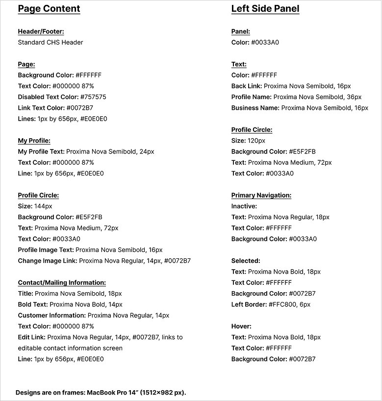
Dev Mode in Figma was not yet available to our team, so design files included more detailed annotations and documentation to ensure clarity.
Final Figma files with specs and components
Annotated flows and interactions
Mobile and desktop variations
Supporting documentation for behavior and logic
Iterations
Design updates made during development in response to newly discovered backend limitations and functionality.
Community Manager emails
Text field boxes
Additional error messaging
Additional Features
New functionalities introduced as part of the updated user profile experience.
Change Password: Users can update their password directly within the Security section.
Contact Us Modal: Users can share feedback through a built-in modal, helping the team gather insights.
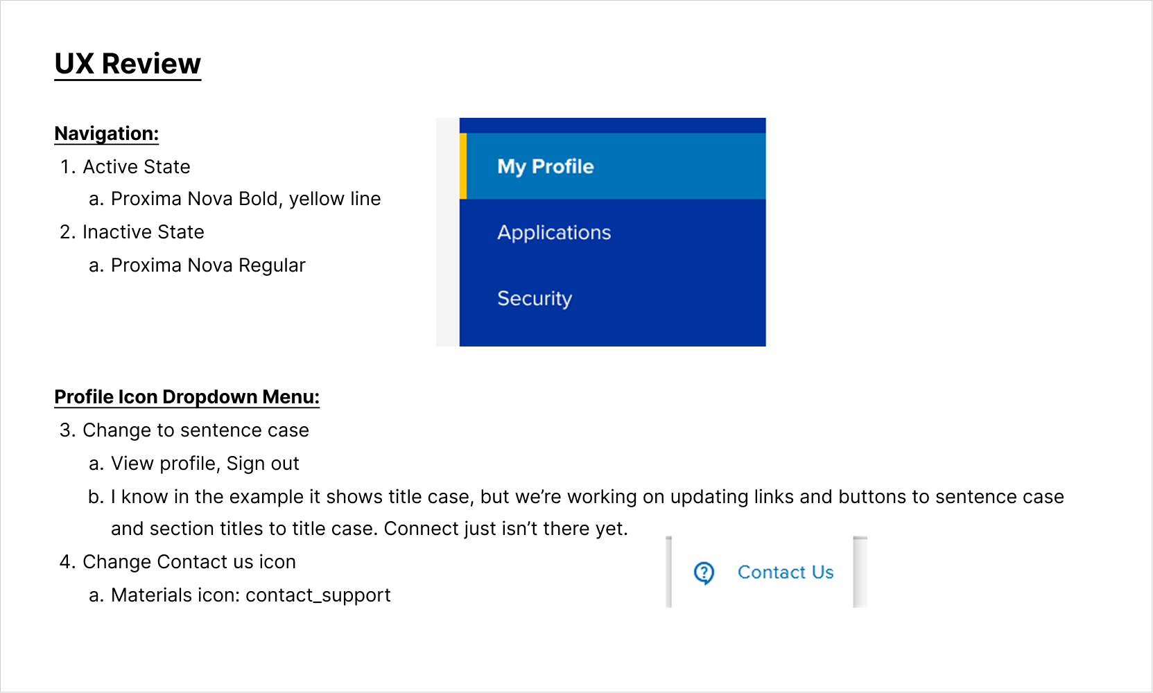
UX Review
Collaborated with developers to resolve design discrepancies before handing off to QA for final testing.


05 User Research
A/B Usability Test
A comparative usability test between the original Edit Registration design and the updated My Profile experience.
Created research script and recruited customers for virtual sessions.
Analyzed recordings and transcripts to identify pain points.
Synthesized findings into an affinity diagram.
Ideated solutions and designed potential improvements.
Shared findings with the team to prioritize features for this version and future consideration.
Data
Edit Registration Tasks
0/5 users completed both tasks
My Profile Tasks
5/5 completed Change Phone Number
3/5 completed Add MyCHS
2 users relied on familiarity from the earlier version
7 Point Scale
Each experience was rated on a scale of 1 to 7 across seven categories: Findability, Fulfillment, Intuitiveness, Usefulness, Satisfaction, Appeal, and Look & Feel.
The overall user experience score improved 67% with the updated version of My Profile.
Key Insights
Improvements:
Phone number update issues in Edit Registration were resolved in My Profile.
Digital Access showed minimal improvement and will be addressed in future updates.
Recommend adding confirmation snack bars for all successful updates.
Requested Features (Out of Scope):
Account Authority
Business Registration Notification
Communication Preferences in My Profile
Personalized Dashboard in Portal


06 Product Release
Outcome
Successful release with no deployment issues
Product release slide deck was then shared with community managers and stakeholders to communicate new features and functionality.
Key Insights After Release
Users misused the Contact Us modal for service requests.
Updated to a Feedback Modal to better align with the intended purpose and reduce support overhead.
Users need a clear way to access My Profile from MyCHS and CHS Connect.
This navigation gap was known and is already in the backlog for those teams to add a link in the profile dropdown menu.

07 Future Improvements
Goal
Continue evolving the profile experience to better meet user needs and system requirements
Planned Features
Improved Digital Access page and request flow
Support for multiple phone numbers
Replace username with email address as the primary login credential
Restrict editing of email address
Manage MFA settings

08 What We Learned
Takeaways
Early collaboration with developers improves alignment and reduces rework. Weekly “Pentagon” meetings (PO, UX, Tech Lead, Engineer Lead, Scrum Master) have been introduced to support this.
User research and testing uncover valuable insights. Conducting research early and throughout the process saves time and effort during development.
UX reviews before QA handoff reduces testing effort and catch issues earlier. UX review checkpoints are now part of the standard workflow.
Moving Forward
These lessons are shaping more efficient workflows, stronger collaboration, and a more consistent UX process across the team.

Testimonial
Carly Graves, Product Owner
“Allison is a top-notch designer! She joined my team as the first UX designer in a security space at CHS. We knew we needed someone on the team to help guide the customer experience, but Allison quickly exceeded every expectation—and I know our product is so much better because of her. She took a complex customer registration and access fulfillment process and transformed it into an intuitive experience that our customers enjoy (and the data shows, a 67% increase is customer satisfaction!). She has been a driving force for connecting with customers and building security products that protect our customers without adding friction to their day.
Allison is more than a UX designer - she is thoughtful, collaborative teammate and brings a ton of positive energy to our space! Her impact on my team and on UX at CHS will be long-lasting!”